

Colleges
- American Athletic
- Atlantic Coast
- Big 12
- Big East
- Big Ten
- Colonial
- Conference USA
- Independents (FBS)
- Junior College
- Mountain West
- Northeast
- Pac-12
- Patriot League
- Pioneer League
- Southeastern
- Sun Belt
- Army
- Charlotte
- East Carolina
- Florida Atlantic
- Memphis
- Navy
- North Texas
- Rice
- South Florida
- Temple
- Tulane
- Tulsa
- UAB
- UTSA
- Boston College
- California
- Clemson
- Duke
- Florida State
- Georgia Tech
- Louisville
- Miami (FL)
- North Carolina
- North Carolina State
- Pittsburgh
- Southern Methodist
- Stanford
- Syracuse
- Virginia
- Virginia Tech
- Wake Forest
- Arizona
- Arizona State
- Baylor
- Brigham Young
- Cincinnati
- Colorado
- Houston
- Iowa State
- Kansas
- Kansas State
- Oklahoma State
- TCU
- Texas Tech
- UCF
- Utah
- West Virginia
- Illinois
- Indiana
- Iowa
- Maryland
- Michigan
- Michigan State
- Minnesota
- Nebraska
- Northwestern
- Ohio State
- Oregon
- Penn State
- Purdue
- Rutgers
- UCLA
- USC
- Washington
- Wisconsin
High School
- Illinois HS Sports
- Indiana HS Sports
- Iowa HS Sports
- Kansas HS Sports
- Michigan HS Sports
- Minnesota HS Sports
- Missouri HS Sports
- Nebraska HS Sports
- Oklahoma HS Sports
- Texas HS Hoops
- Texas HS Sports
- Wisconsin HS Sports
- Cincinnati HS Sports
- Delaware
- Maryland HS Sports
- New Jersey HS Hoops
- New Jersey HS Sports
- NYC HS Hoops
- Ohio HS Sports
- Pennsylvania HS Sports
- Virginia HS Sports
- West Virginia HS Sports
ADVERTISEMENT
Install the app
How to install the app on iOS
Follow along with the video below to see how to install our site as a web app on your home screen.
Note: This feature may not be available in some browsers.
You are using an out of date browser. It may not display this or other websites correctly.
You should upgrade or use an alternative browser.
You should upgrade or use an alternative browser.
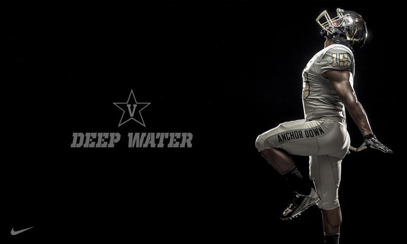
FOOTBALL Uniforms Unveiled
- Thread starter SpaceRaider
- Start date
Now if they would only remove the Pegasus...
The black helmets are still there so they will have a black jersey option. As far as gray goes, it needs to be a bit darker than what we had before. I personally think these new ones are a bit plain but the helmets are better and that helps it. I like the neck design too. I get what they were trying to do. Overall, they look fine.
Love the bigger numbers. Hate the Raiders down the side of the leg. Tacky.
I see the Pegasus is still on the helmets.
LOL, the pegasus catches a ton of grief on here
I could care less; however, if the players feel bigger, stronger and faster than lets roll!
I'm a little relieved that there were no flashdance type photos like when vandy released images of a new uniform...
A nice "huge" adjustment that was much needed, returning the number on the jersey back to a size that can be seen by fans. It's been frustrating the last couple of years trying to learn new players, and which player did what. The exact font like back to the old fashioned large block numbers is not so much important to me, that the numbers are large enough and clear enough to be discernible by the typical fan is what matters.
Ok, I know I need to get out more, but I'm going to ask this question anyways:
With talk of uniform changes, I had hoped for helmets with MT sans the pegasus.
So, is this just an echo chamber in here? Is it just the posters on the board that seem to want to get rid of the horse immediately? Are people on here encountering others in real life i.e. around the community that speak of the horse needing to be removed?
I don't know if it's just a handful of posters making a bunch of noise here, or if there is a large segment of the MT population that want to see pegasus removed?
I would be curious to learn what others on here hear from friends, family, coworkers, fellow alums, etc etc regarding the horse still on the logo.
In my opinion, the time of the pegasus has come and gone. It has outstayed it's welcome. It's kind of like the friend who came to the party that refuses to leave even though everyone else is leaving and telling them it's time to leave. To top it off, they don't even know that others are almost embarrassed for them because they are clueless that they are the socially awkward guest that has outstayed his welcome.
One more comment on this topic:
Often when making big changes, plans, or substantial moves, a question fails to be asked. If and when we can ever get rid of the pegasus, what then? Specifically as this relates to MT, what is a Blue Raider?
IMO, MT on the football helmets would be fine with me for the time being. After that though, what then? Any other logo? What logo matches a Blue Raider? It will likely be an important question for MT logo, image, and branding for the future, what is a Blue Raider?
I like the changes. I just wish we had gotten rid of "Raiders" on the pants leg too. I can't stand anything on our uniform that I saw Memphis do first.
Hey, if I'm not mistaken, those are the new helmets designed by experts in top fields i.e. engineering, neuroscientist, etc to help reduce concussions. Supposedly state of the art and a little bit of a softer feel to the helmet. That is if these are the helmets I heard and read about this summer. Hopefully these new helmets will be protecting these football players better. Concussions aren't something to play with.
I don't care if they wear speedos and a tank top. Just win a dang championship and bowl game.
I care. I really don't want to see speedos.
Back in 2010, I was shopping for Blue Raider gear and was looking for items that didn't have the Pegasus. I was told that Coach Stock was the power behind keeping it. At least, for football. Something about concerns that Middle Tennessee being confused with Montana and Montana St. Since MT is the abbreviation of that state. I laughed. First of all, they're both 1- AA programs, both schools are located west of the Rockies and neither incorporate MT in their logo.
I noticed block MT on the collar and horse on the helmet. Switch them if you can't get rid the horse. I agree. Are we the only ones who think the Pegasus has long overstayed it's welcome? Don't care for the RAIDERS down the leg. Like the bigger numbers. Overall, C+ effort from Nike. Maybe, we should ask for a prototype from Under Armour?
I noticed block MT on the collar and horse on the helmet. Switch them if you can't get rid the horse. I agree. Are we the only ones who think the Pegasus has long overstayed it's welcome? Don't care for the RAIDERS down the leg. Like the bigger numbers. Overall, C+ effort from Nike. Maybe, we should ask for a prototype from Under Armour?
I just got a few shirts from both Lightning's and Alumni Hall. None of them have the pegasus. I made a point of it. Some are champion shirts, some are Nike. One I got for my 2 year old does have it. What was really sad was that many of the toddler shirts had the cartoon mascot. I'm all for the shirts being kiddy, but our mascot is kiddy even when it tries not to be. It has to go and so does the pegasus.
As for the uniforms since that's the topic, I honestly like the simplicity of it.
As for the uniforms since that's the topic, I honestly like the simplicity of it.
Lightning rocks, big part of our success and furture ride on his glorious wings. Anybody who has a problem needs to look in the mirror, jealous much? Mad cause you don't have wings and a strong moral compass? Don't take it out on lighting.
Is it a thing to pose as a "fan" just to troll?
As a long time MT fan, it took me a while to process the new unis but I like them. But I too would like to see the Pegasus removed from the block logo
As a long time MT fan, it took me a while to process the new unis but I like them. But I too would like to see the Pegasus removed from the block logo
I for one am a supporter of the plain block MT. Even back in the days of the General, we used the plain block MT on helmets, hats, jackets, hats and ect. So keep the Pegasus if some like it, but NOT on helmets and hats and such for team apparel.
D-winns
D-winns
Similar threads
- Replies
- 23
- Views
- 1K
- Replies
- 5
- Views
- 618
- Replies
- 46
- Views
- 8K
- Replies
- 1
- Views
- 222
ADVERTISEMENT
ADVERTISEMENT