Gotta say, this is pretty cool. They need to hype the hell out of it.


Follow along with the video below to see how to install our site as a web app on your home screen.
Note: This feature may not be available in some browsers.
I love Oregon’s court. Please don’t have anything like FIU.I like a traditional court. I don't like all the designs and colors like FAU, Oregon, etc. all over the court.
I dread the results of this....
Yeah, isn't this how we ended up with a pegasus for a mascot?!?!
If McPhee has any say the wording on the court will be in Chinese.I dread the results of this....
Like that damn mascot garbage and logo.I dread the results of this....
I want unique but not god awful. I would do something similar to the Edinburgh one here:Question. Working on this (had to get my mind refocused after WVU losing by one point..grrr)
Who wants simple like we have, but updated, and who wants unique? Some out there are beyond ugly. Some are a bit different. FIU (leaves in corners), Notre Dame (shamrock in middle), and Northern Kentucky (norse across court).
I want it to look different than now, but not be ugly. LOL. I don't want my submission to fall in to the category above of being one of the "dreaded results" haha. Suggestions?

 boards.sportslogos.net
I want unique but not god awful. I would do something similar to the Edinburgh one here:
Designing the courts of the British Basketball League and others (Retro Night!)

So True! I hate it!Like the plain MT with the lightening bolt. Surprised that someone didn’t use mtsu. Still cannot believe they carved that into the brick on all the new entrances onto campus. That looks terrible! So much for branding…..
McPhee strikes again. How much longer are we gonna have this clown?So True! I hate it!
Maybe the state with the three stars where the Boro is locatedI like the idea of the state outline somewhere on the court with some indicator of either the mid-state area or the school's location in the geographic center of the state. That probably wouldn't work at mid-court along with the logo.
Maybe the state with the three stars where the Boro is located
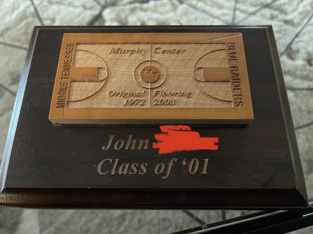
Man. This so right. We all just got used to it I guess.Whoever wins I hope they do the MT block lettering at mid court and I hope it’s ever so slightly off center to keep with tradition 😂
That floor is ugly.Saw Memphis on TV yesterday. Floor looks good. Hopefully photo shows up.
🤢 🤮Saw Memphis on TV yesterday. Floor looks good. Hopefully photo shows up.
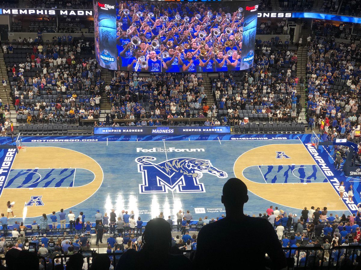
I can see the beauty in Oregon’s floor and the flair in Boise’s Smurf turf. But Memphis’ floor just looks uglythe memphis floor made me think of what Boise St and Oregon did with their football fields. I'm fine with the Penn State approach, though. Plain and simple. Speaking of facilties, there's a local high school who IMO has better facilities than MT, but I do wonder what Bear Bryant would think about these schools getting all fancy with practice facilities? I wonder if The Bear would prefer his players train like Rocky Balboa trained to fight Ivan Drago...

Top one is my favorite so far.